Read the Buzz Blog2022
A Colour for a Year of Transformation and Possibilities — Very Peri
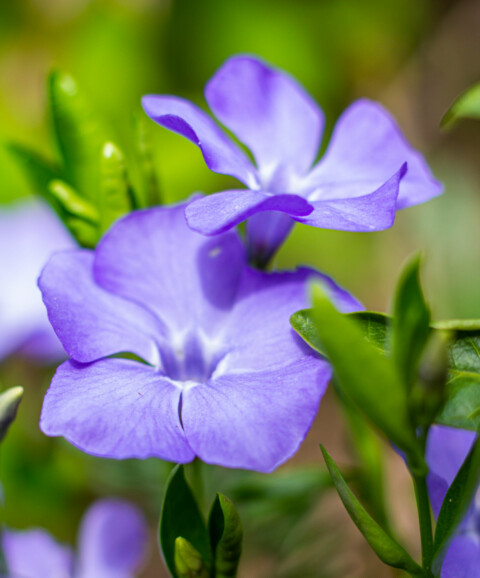
Pantone’s colour experts were very optimistic when choosing “Very Peri” as the colour of 2022. Pantone sought to evoke feelings of both serenity and excitement. This blueish-purple shade is meant to represent transformation and possibilities, making it the perfect colour for the year ahead.
Pantone’s “Very Peri” is a periwinkle colour that can represent both change and progress, as well as peace and stability.
One way to bring “Very Peri” into your life is by using it as an accent colour. Try adding a touch of purple to your outfits or home decor. You could also use it as part of your branding.
When it comes to branding and marketing, using the correct colour can be incredibly important. If you’re looking to evoke calm and relaxation try bringing in some photos and illustrations using these shades. The energetic digital world will embrace this colour for its unique gender-neutral beauty.
Whatever you do, make sure to have some fun with Pantone’s colour of the year!

 Allen Haslinger